Main Menu Redesign
Before the Stars » Devlog
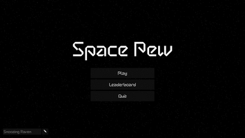
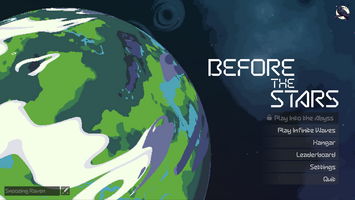
For the main menu, I wanted to move away from the simple prototype and make something eye-catching. Feedback is very welcome!


For the main menu, I wanted to move away from the simple prototype and make something eye-catching. Feedback is very welcome!
Comments
Log in with itch.io to leave a comment.
I don't know which one is the prototype, and which one is the new design. I like the planet - but the plain space black background also looks good.
The second one is the new design. I don't dislike the prototype either, it's just a bit too plain for what I was going for.